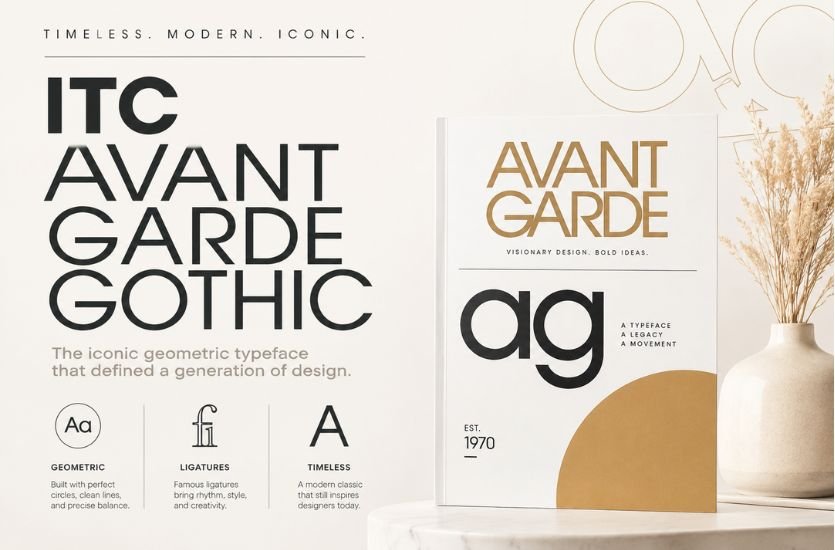

Some typefaces quietly serve their purpose in the background, while others become defining symbols of an era. ITC Avant Garde Gothic belongs to the latter category. With its perfectly balanced geometric forms, striking ligatures, and unmistakably modern appearance, this iconic font has influenced graphic design, branding, advertising, and editorial publishing for more than five decades. From luxury fashion campaigns to magazine covers and corporate logos, its clean yet expressive style has remained relevant despite changing design trends.
Originally created as a custom logotype for a groundbreaking magazine, ITC Avant Garde Gothic evolved into one of the world’s most recognizable geometric sans-serif typefaces. Its distinctive letterforms reflect the optimism and innovation of the late 1960s while continuing to inspire contemporary designers seeking elegance, simplicity, and visual impact. Although many modern fonts have borrowed elements from its design, few possess the same artistic personality and historical significance.
Understanding ITC Avant Garde Gothic involves more than recognizing its attractive appearance. Its story is deeply connected to influential designers, revolutionary typography, and a period when graphic design was rapidly transforming into an expressive art form. The font represents a perfect blend of creativity and precision, proving that typography can communicate emotion as effectively as images.
What Is ITC Avant Garde Gothic?
ITC Avant Garde Gothic is a geometric sans-serif typeface developed by legendary graphic designers Herb Lubalin and Tom Carnase. Released in 1970 by the International Typeface Corporation (ITC), the font originated from the custom lettering created for Avant Garde magazine. What began as a unique logo eventually expanded into a complete typeface family after designers around the world requested access to its striking letterforms.
The typeface belongs to the geometric sans-serif category, meaning its letters are primarily constructed using circles, straight lines, and carefully measured proportions. This geometric foundation gives the font a clean, modern, and highly organized appearance. Unlike more traditional sans-serif fonts that prioritize neutrality, ITC Avant Garde Gothic possesses a strong visual identity, making it particularly suitable for headlines, branding, and display applications.
Over the decades, the font has become synonymous with sophistication, creativity, and contemporary design. Even in today’s digital world, designers continue to rely on ITC Avant Garde Gothic when they want typography that feels both timeless and distinctive.
The Story Behind the Typeface
The history of ITC Avant Garde Gothic begins with Avant Garde magazine, a publication launched in the late 1960s by publisher Ralph Ginzburg. The magazine aimed to challenge conventional thinking through bold journalism, provocative content, and innovative visual design. To match this vision, Herb Lubalin created a custom logotype that immediately captured attention.
Lubalin’s logo featured perfectly balanced geometric letterforms with elegant spacing and creative ligatures. Rather than simply placing letters beside one another, many characters seamlessly connected, creating a flowing visual rhythm unlike anything commonly seen in commercial typography. The logo quickly became one of the magazine’s defining features.
Graphic designers admired the lettering so much that they repeatedly asked Lubalin whether a complete alphabet existed. Initially, he resisted these requests because he viewed the design as an exclusive identity created specifically for the magazine. However, the overwhelming interest eventually convinced him that expanding the logo into a complete typeface would benefit the broader design community.
Working alongside fellow designer Tom Carnase, Lubalin transformed the original lettering into a comprehensive font family. The resulting typeface preserved the elegance of the original logo while providing the versatility needed for professional typography across various media.
Herb Lubalin: A Visionary of Modern Typography
Any discussion of ITC Avant Garde Gothic inevitably centers on Herb Lubalin, one of the twentieth century’s most influential graphic designers. Born in New York, Lubalin developed a reputation for treating typography not merely as a method of displaying words but as a powerful artistic medium capable of conveying emotion, personality, and meaning.
Throughout his career, Lubalin designed numerous magazine layouts, advertising campaigns, logos, and corporate identities. His work often blurred the boundary between illustration and typography, using letterforms themselves as visual elements rather than simple carriers of information.
Lubalin believed typography should actively engage readers rather than remain invisible. This philosophy became especially apparent in the creation of the Avant Garde logo, where carefully crafted ligatures transformed ordinary words into memorable graphic compositions.
His influence extends far beyond ITC Avant Garde Gothic. Many contemporary designers continue to study his work for its creativity, originality, and willingness to challenge traditional design conventions.
Tom Carnase’s Essential Contribution
While Herb Lubalin provided the artistic vision, Tom Carnase played an equally important role in bringing the typeface to life. Carnase possessed exceptional technical skill in lettering and typography, making him the ideal collaborator for transforming a custom logo into a functional font family.
Developing a complete alphabet required far more than copying the original logo. Every uppercase and lowercase letter, numeral, punctuation mark, and special character needed to maintain consistent proportions while preserving the unique personality of the design. Carnase carefully refined each character, ensuring the family worked harmoniously across different words and layouts.
His craftsmanship helped establish ITC Avant Garde Gothic as one of the highest-quality typefaces of its era. The collaboration between Lubalin’s artistic direction and Carnase’s technical precision produced a font that remains admired decades after its release.
The Birth of the International Typeface Corporation
The release of ITC Avant Garde Gothic coincided with an important moment in typography history. During the late 1960s and early 1970s, the International Typeface Corporation emerged as an innovative organization dedicated to producing high-quality typefaces for the rapidly evolving publishing and advertising industries.
Unlike traditional type foundries, ITC emphasized creative freedom and modern design while adapting typography for emerging phototypesetting technologies. ITC Avant Garde Gothic became one of the company’s flagship releases and quickly established its reputation among professional designers worldwide.
The typeface represented more than just another font. It demonstrated how typography could evolve alongside advances in printing technology while maintaining exceptional artistic standards.
Understanding the Geometric Design Philosophy
One reason ITC Avant Garde Gothic feels so distinctive is its strict adherence to geometric principles. Many letters are based on perfect circles, horizontal strokes, and vertical lines arranged with mathematical precision. This approach creates an impression of order, balance, and modernity.
Circular forms dominate characters such as O, C, G, and Q, while letters including H, E, F, and L rely on clean straight strokes. The consistent proportions create visual harmony across the entire alphabet, allowing words to appear cohesive and elegant.
Despite this structured construction, the font avoids looking mechanical. Slight adjustments to spacing, stroke relationships, and character proportions introduce warmth and personality without compromising the geometric foundation.
The result is typography that feels both disciplined and expressive, making it equally effective for luxury branding, editorial headlines, advertising campaigns, and artistic projects.
The Famous Ligatures That Defined an Era
Perhaps no feature distinguishes ITC Avant Garde Gothic more than its remarkable collection of ligatures. In typography, a ligature combines two or more letters into a single unified character. While ligatures traditionally improve readability, Lubalin transformed them into artistic expressions.
Combinations such as “AV,” “NT,” “OO,” “TT,” and numerous others became elegant graphic elements rather than simple letter pairs. These connected forms reflected the original Avant Garde logo while giving designers tremendous creative flexibility.
When used thoughtfully, ligatures create visual rhythm and sophistication that few other typefaces can match. They encourage designers to think beyond individual letters and consider entire words as graphic compositions.
These decorative alternatives became especially popular during the 1970s, appearing in magazine headlines, album covers, fashion advertising, and corporate branding. Even today, OpenType versions of ITC Avant Garde Gothic include many of these classic alternates, allowing modern designers to recreate the expressive typography that made the font famous.
The Complete Font Family
As the popularity of ITC Avant Garde Gothic grew, the typeface expanded into a versatile font family capable of meeting a wide range of design needs. The original release included several weights, allowing designers to maintain a consistent visual identity while introducing subtle variations in emphasis. These weights ranged from Light and Book to Medium, Demi, and Bold, each accompanied by matching oblique styles that preserved the geometric elegance of the upright versions.
Over time, additional condensed styles were introduced to accommodate layouts with limited horizontal space. These condensed versions retained the essential characteristics of the original design while allowing headlines and branding elements to fit more compact compositions. Modern digital editions have further expanded the family by adding OpenType functionality, multilingual character sets, stylistic alternates, and the extensive ligature collection that helped establish the font’s reputation.
This versatility has enabled ITC Avant Garde Gothic to remain useful across print and digital media alike. Whether used in magazine headlines, corporate branding, website interfaces, or product packaging, designers can select a weight and style that complements the overall visual hierarchy without sacrificing consistency.
Why Designers Continue to Love ITC Avant Garde Gothic
One of the greatest strengths of ITC Avant Garde Gothic is its remarkable balance between simplicity and personality. Many sans-serif typefaces are intentionally neutral, allowing surrounding design elements to take center stage. Avant Garde Gothic, however, manages to remain clean and modern while possessing a distinctive identity that immediately catches the viewer’s attention.
Its geometric construction communicates precision, professionalism, and confidence. At the same time, the graceful curves and signature ligatures introduce a sense of elegance that softens the rigid mathematical structure. This unique combination allows the typeface to feel luxurious without becoming overly decorative.
Designers also appreciate the font’s ability to evoke different moods depending on how it is used. In luxury branding, it communicates sophistication and exclusivity. In technology branding, it represents innovation and forward-thinking design. In fashion magazines, it feels stylish and artistic, while in advertising it creates memorable headlines that command attention.
Another reason for its enduring popularity is its timeless quality. Although it emerged during the design revolution of the late 1960s and early 1970s, ITC Avant Garde Gothic has never appeared trapped in a particular era. Instead, it continues to adapt successfully to changing design trends while retaining its recognizable personality.
Common Applications Across Industries
ITC Avant Garde Gothic has found a home in virtually every area of visual communication. Its strongest applications remain headlines, logos, editorial design, and branding, where its striking appearance can create maximum impact.
Fashion brands frequently use the font because its geometric elegance aligns naturally with luxury aesthetics. High-end cosmetics, clothing labels, jewelry companies, and lifestyle publications often rely on its refined appearance to communicate sophistication and exclusivity.
Editorial designers value the font for magazine covers, feature titles, and promotional spreads. Large headlines benefit from its bold geometric forms, while carefully selected ligatures add artistic flair that helps publications establish a distinctive visual identity.
Advertising agencies have long appreciated its ability to capture attention quickly. Whether promoting consumer products, automobiles, technology, or entertainment, ITC Avant Garde Gothic creates memorable headlines that remain readable while projecting confidence and modernity.
Corporate branding is another area where the typeface excels. Businesses seeking a clean yet recognizable identity often choose Avant Garde Gothic for logos, stationery, signage, packaging, and marketing materials. Its balanced proportions communicate reliability while still appearing contemporary.
Digital designers also incorporate the font into websites, mobile applications, presentation graphics, and user interface elements. Although it is generally reserved for headings rather than body text, it contributes a polished and premium appearance that enhances modern digital experiences.
The Importance of Readability
Despite its many strengths, ITC Avant Garde Gothic is not intended for every typographic situation. One of the most common criticisms involves readability in extended passages of text. The geometric letterforms, tight spacing, and decorative ligatures that make the typeface visually attractive can become tiring when reading large blocks of content.
For this reason, professional designers typically reserve ITC Avant Garde Gothic for headlines, short paragraphs, pull quotes, advertisements, and branding elements rather than books or lengthy articles. In these display applications, its distinctive personality becomes an advantage rather than a limitation.
Modern OpenType versions provide greater flexibility by allowing designers to control ligatures and stylistic alternates. Disabling certain decorative features can improve readability while preserving the font’s essential character, making it more adaptable to different design contexts.
Comparing ITC Avant Garde Gothic with Similar Fonts
Many geometric sans-serif fonts share certain visual characteristics with ITC Avant Garde Gothic, yet each possesses a unique identity.
Futura, one of the earliest geometric sans-serif typefaces, emphasizes functional simplicity and exceptional readability. While both fonts rely on circles and straight lines, Futura generally appears more restrained and practical, whereas Avant Garde Gothic embraces expressive ligatures and artistic letter combinations.
Avenir, designed decades later, combines geometric precision with subtle humanist influences. It offers improved readability for body text while maintaining a clean contemporary appearance. Designers often choose Avenir when versatility takes priority over decorative expression.
Century Gothic also shares geometric proportions but lacks the distinctive ligatures and visual personality that define ITC Avant Garde Gothic. It serves well as a practical system font but does not deliver the same artistic impact.
These comparisons highlight an important distinction. ITC Avant Garde Gothic was never intended to be simply another geometric sans-serif font. Its purpose has always been to combine typography with graphic design, transforming words into memorable visual experiences.
The Digital Evolution of the Typeface
As typography transitioned from metal type to phototypesetting and eventually to digital publishing, ITC Avant Garde Gothic evolved alongside changing technology. Early digital versions sometimes omitted the extensive ligature collection because software limitations made alternate glyphs difficult to implement.
The introduction of OpenType technology changed this dramatically. Modern releases restored the original alternate characters while adding advanced typographic features such as contextual alternates, stylistic sets, expanded language support, and improved kerning.
These improvements have allowed contemporary designers to experience the font much as Herb Lubalin originally envisioned it. Digital publishing platforms now make it possible to activate sophisticated ligatures with a single setting, bringing renewed appreciation for the typeface among a new generation of creatives.
Best Practices for Using ITC Avant Garde Gothic
Successful use of ITC Avant Garde Gothic depends largely on understanding its strengths. Large headlines allow the geometric structure and elegant ligatures to become prominent visual features, while generous spacing around the text helps emphasize its clean forms.
Pairing the font with a traditional serif typeface often creates an attractive contrast. The serif font provides comfortable readability for body text, while Avant Garde Gothic supplies modern visual energy in titles and section headings.
Designers should exercise restraint when using decorative ligatures. Although these features are among the font’s defining characteristics, excessive use can reduce clarity. Carefully selected combinations produce a sophisticated effect without distracting readers.
Maintaining appropriate letter spacing and avoiding very small font sizes further improves legibility. Because the design relies on precise geometric relationships, giving the letters adequate room to breathe enhances both readability and visual elegance.
The Lasting Legacy of ITC Avant Garde Gothic
Few typefaces remain influential for more than half a century, yet ITC Avant Garde Gothic continues to inspire designers around the world. Its enduring appeal lies not only in its appearance but also in the creative philosophy behind its development. Herb Lubalin and Tom Carnase demonstrated that typography could function as both communication and art, encouraging designers to think beyond ordinary letterforms.
The font’s influence extends into countless modern typefaces that borrow elements of its geometry, spacing, and minimalist elegance. Even designers who never directly use ITC Avant Garde Gothic have likely encountered its legacy through contemporary branding, editorial design, and digital interfaces inspired by its principles.
As visual communication continues evolving across print, web, and mobile platforms, the timeless qualities of geometric balance, artistic precision, and expressive typography remain as valuable as ever. ITC Avant Garde Gothic stands as a reminder that truly exceptional design transcends trends, continuing to communicate beauty and clarity across generations.
Conclusion
ITC Avant Garde Gothic is far more than a geometric sans-serif typeface. It is a landmark achievement in the history of typography, born from the creative vision of Herb Lubalin and refined through the craftsmanship of Tom Carnase. What started as a magazine logo evolved into one of the most influential display fonts ever created, admired for its perfect geometry, iconic ligatures, and unmistakable modern character.
More than fifty years after its release, the typeface continues to play an important role in branding, publishing, advertising, fashion, and digital design. Its ability to combine mathematical precision with artistic expression has earned it a permanent place among the world’s most celebrated fonts.
For designers seeking typography that conveys sophistication, originality, and timeless elegance, ITC Avant Garde Gothic remains one of the finest choices available. Its enduring legacy proves that exceptional typography is not simply about arranging letters—it is about shaping visual experiences that leave a lasting impression long after the words have been read.